I have been playing with an opensource software called Gephi for several months. I believe it is one of the best non-proprietary network visualization softwares currently out there. Gephi allows users to visualize, navigate and understand relational dataset such as social network data, quickly and efficiently. 0.8 beta which was just released less than a week ago includes some major enhancements and bug fixes.
Gephi is fairly big project with large sourcecode base. If you want to write plugins or modify sourcecode, it could be overwhelming in the beginning. Once you understand the structure, it gets easier but still non-trivial.
I was once trying to wrap my head around the structure of Gephi sourcecode and I thought it would be interesting to use Gephi to understand Gephi sourcecode.
I wrote a small script in Ruby to go through the sourcecode and lookfor import statement and created list of directional links from one class to the other. I made the script output a network file which I can open in Gephi to visualize. Since I was only interested in Gephi project, I decided to narrow down the scope to org.gephi only.
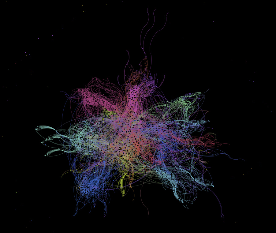
I ran one of the built-in layout algorithm, ForceAtlas 2, and colored the network by top-level module(below). Besides a pretty picture, you can see some clusters in the network but center of the network looks like there are many cross referencing.
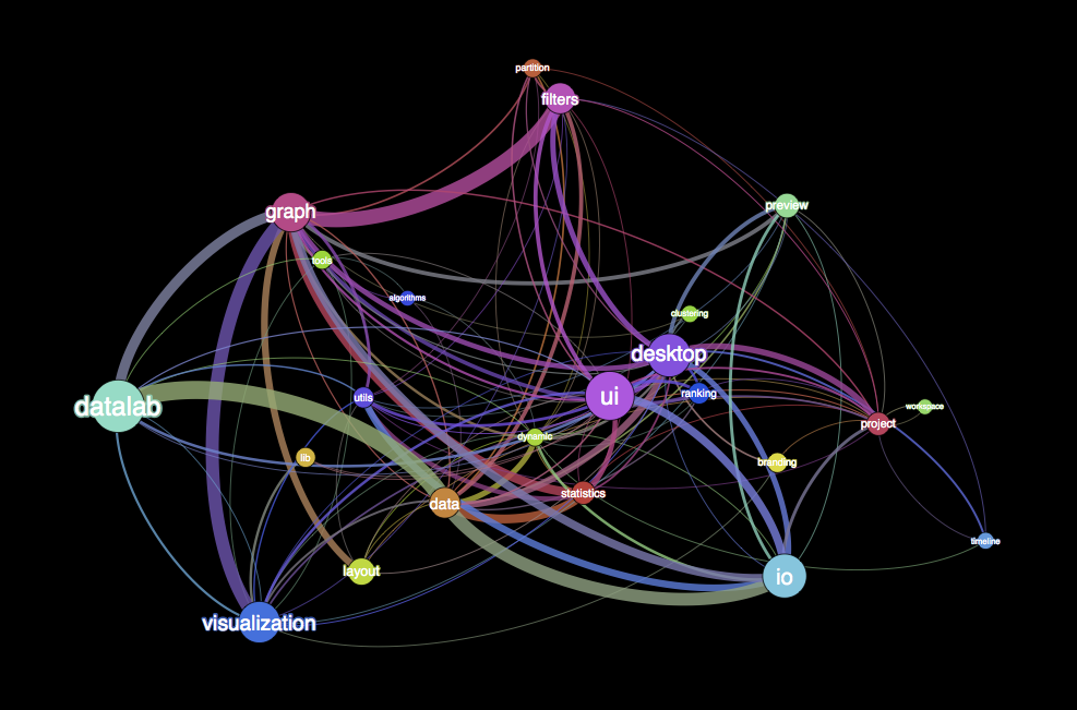
In order to see more structure in the network, I grouped nodes based on their membership to modules(below). This shows inter-module dependencies of the sourcecode which is very interesting. Nodes are sized by the number of sub-classes and the thickness of edges represent the number of classes connecting different groups in this case, modules. You can see datalab being the largest module based on the number of sub-classes. The average degree is 10.6 which means, if you change sourcecode of a module, you have an average of 10.6 modules you should consider to make sure you don’t have any compatibility issue.
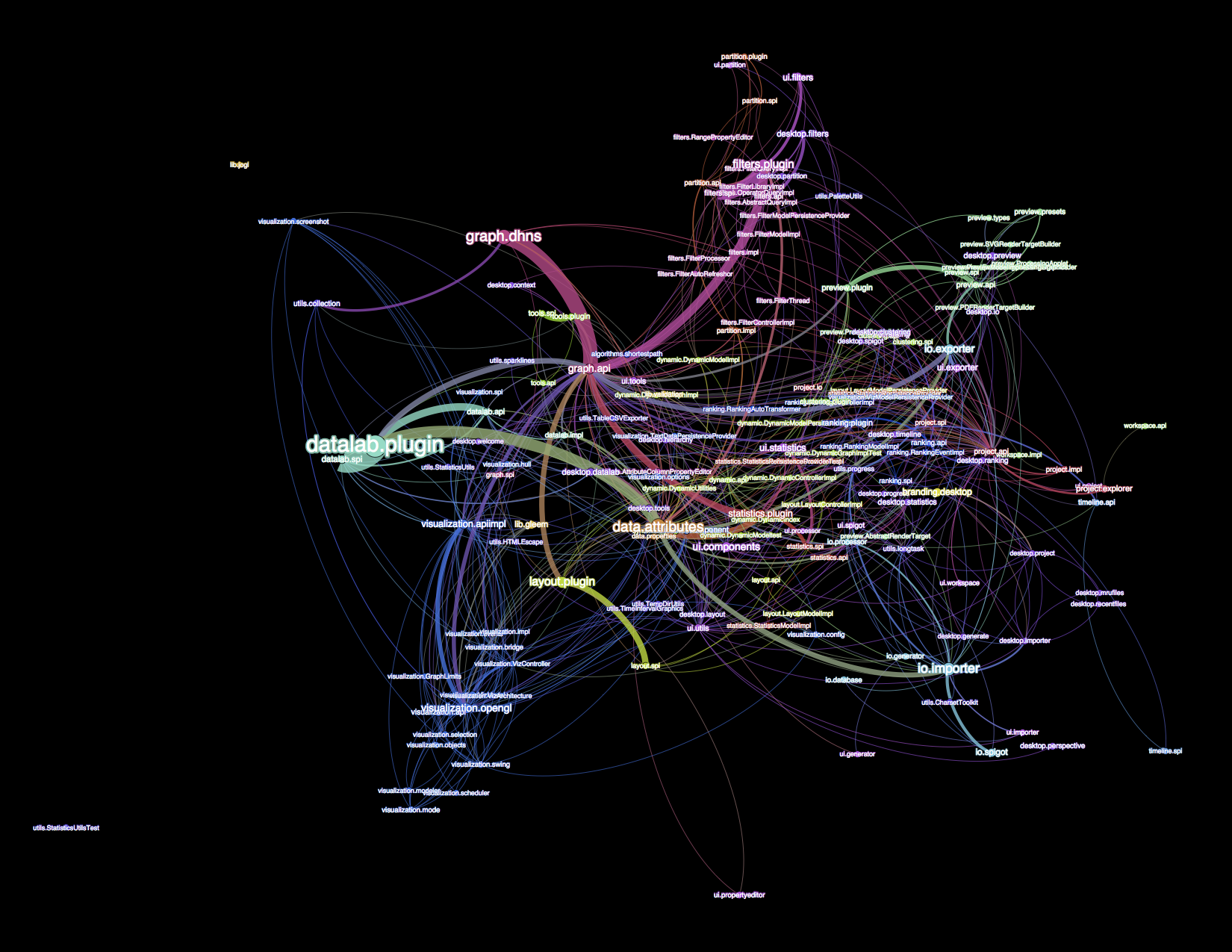
Last picture(below) shows a slightly granular view. Nodes are broken down by one sub-level. In this view, average degree is 7.7.
This was a helpful exercise for me. If I get a chance, I can do this for all previous versions of Gephi to visualize the project’s evolvement.


November 2, 2012 at 10:46 pm
Reblogged this on Bitratchet and commented:
I’ve started keeping an eye out for interesting visualizations, and this is fascinating.