Tag: data visualization

US Investment Activity by State from 2001

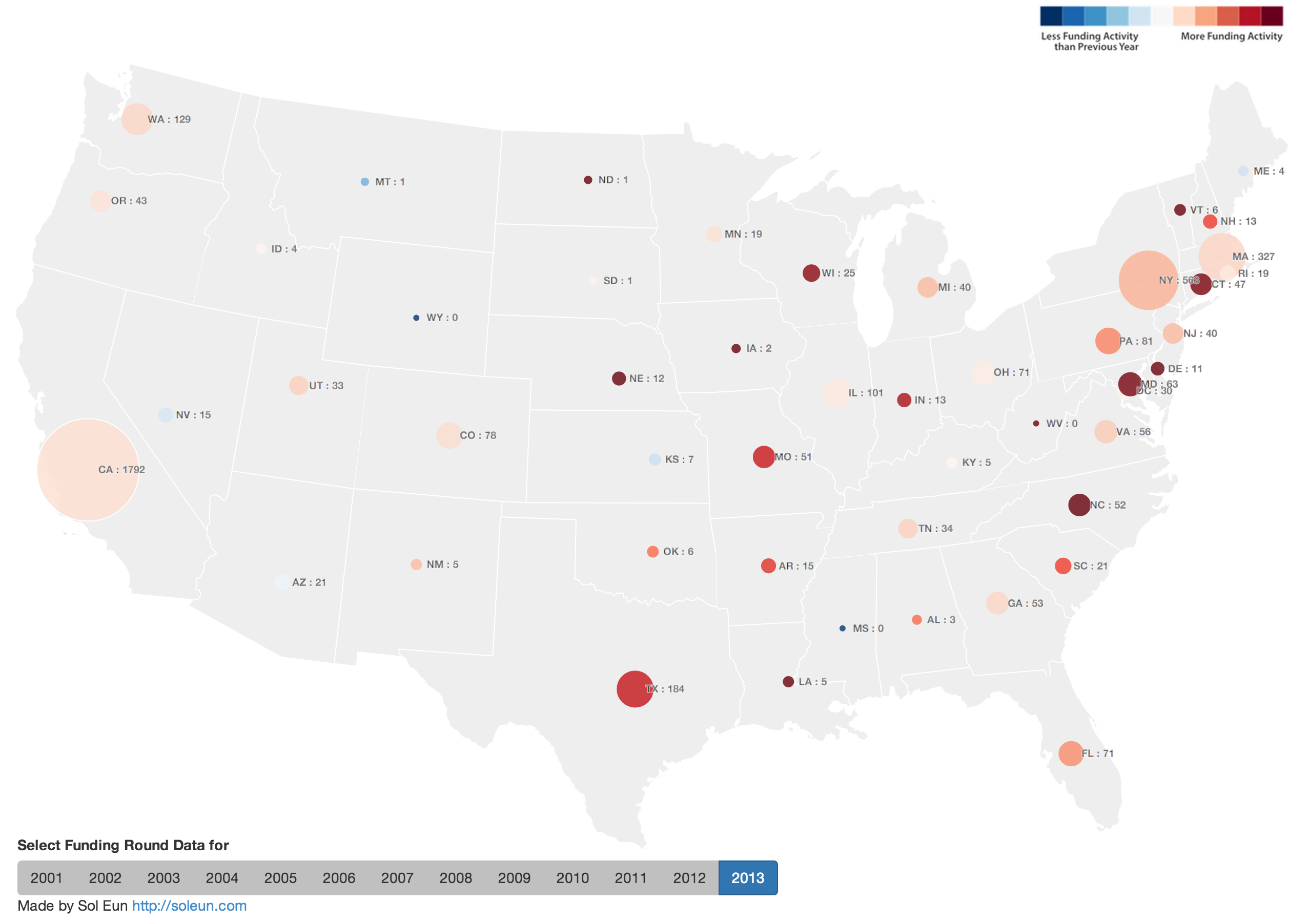
In order to understand the investment activity for private companies in US, I created an interactive map to visualize the number of investment activities(size) and whether the number of activities increased or decreased(color) using CrunchBase data. The number next to state code shows the funding round count for given year. All calculations are based on funding round count not the amount.

Large View

Here are some quick observations. If it is too hard to follow, please click “Large View” link above to open the map in a separate tap/window.

  • The data shows that there was a big jump of funding activities in 2005 compared to 2004 across US. In 2005, companies in California raised 416 rounds compared to 73 in 2004. That’s 469% increase in just one year. During same period, the number of investment rounds for companies in Massachusetts jumped from 18 to 93, a 416% increase. However, NVCA’s yearbook (Link) does not suggest that such jump existed so it may simply because TechCrunch started in 2005 (Link) so they do not have as much coverage before 2005.
  • In 2008, New York passes Massachusetts in terms of number of investment activities and it stays until 2013.
  • You will see the beginning of recession in 2008 but both California and New York raised more rounds than they did in 2007. In 2009, the recession continues and it is the only year in which California’s number decreases since 2002.
  • In 2011, both Illinois and Ohio companies doubles number of investment activities. For Illinois, it could be due to a state-wide effort to encourage startups such as the launch of Startup Illinois (link). Although I could not find a similar state-wide initiative, there were online articles mentioning school and community-wide activities (Link).
  • 2013 shows many east coast states getting higher traction compared to west coast states with North Carolina, Maryland, and Connecticut closing more than double the number from previous year. Although one year is just too short to confirm the trend, it will be interesting to see whether this behavior continues in 2014.
  • Please share your own observations in comment section.
  • Thanks to CrunchBase for awesome dataset and I love the new look. You should check it out. (Link)

Visualizing 350 million people movement in US

A screenshot from 48 states animation (during the time of hurricane Katrina)

I worked on visualizing US address change records for last two months and my work has been published in company’s blog.
I originally started with getting high level pictures from Gephi but realized that Gephi wasn’t quite suited for visualizing what I wanted to convey. So I wrote a program in Java using processing library to gain finer control over some visual primitives for coloring, sizing and animation.

So head over and take a look at the post by clicking the link below.

http://www.spokeo.com/blog/visualizing-us-address-change-records-in-2000-2009

Using Gephi to understand Gephi

I have been playing with an opensource software called Gephi for several months. I believe it is one of the best non-proprietary network visualization softwares currently out there. Gephi allows users to visualize, navigate and understand relational dataset such as social network data, quickly and efficiently. 0.8 beta which was just released less than a week ago includes some major enhancements and bug fixes.

Gephi is fairly big project with large sourcecode base. If you want to write plugins or modify sourcecode, it could be overwhelming in the beginning. Once you understand the structure, it gets easier but still non-trivial.

I was once trying to wrap my head around the structure of Gephi sourcecode and I thought it would be interesting to use Gephi to understand Gephi sourcecode.

I wrote a small script in Ruby to go through the sourcecode and lookfor import statement and created list of directional links from one class to the other. I made the script output a network file which I can open in Gephi to visualize. Since I was only interested in Gephi project, I decided to narrow down the scope to org.gephi only.

I ran one of the built-in layout algorithm, ForceAtlas 2, and colored the network by top-level module(below). Besides a pretty picture, you can see some clusters in the network but center of the network looks like there are many cross referencing.

In order to see more structure in the network, I grouped nodes based on their membership to modules(below). This shows inter-module dependencies of the sourcecode which is very interesting. Nodes are sized by the number of sub-classes and the thickness of edges represent the number of classes connecting different groups in this case, modules. You can see datalab being the largest module based on the number of sub-classes. The average degree is 10.6 which means, if you change sourcecode of a module, you have an average of 10.6 modules you should consider to make sure you don’t have any compatibility issue.

Last picture(below) shows a slightly granular view. Nodes are broken down by one sub-level. In this view, average degree is 7.7.

This was a helpful exercise for me. If I get a chance, I can do this for all previous versions of Gephi to visualize the project’s evolvement.